
This project is owned by Drive By Websites & Drive By Design or the respective client, and is posted with permission.
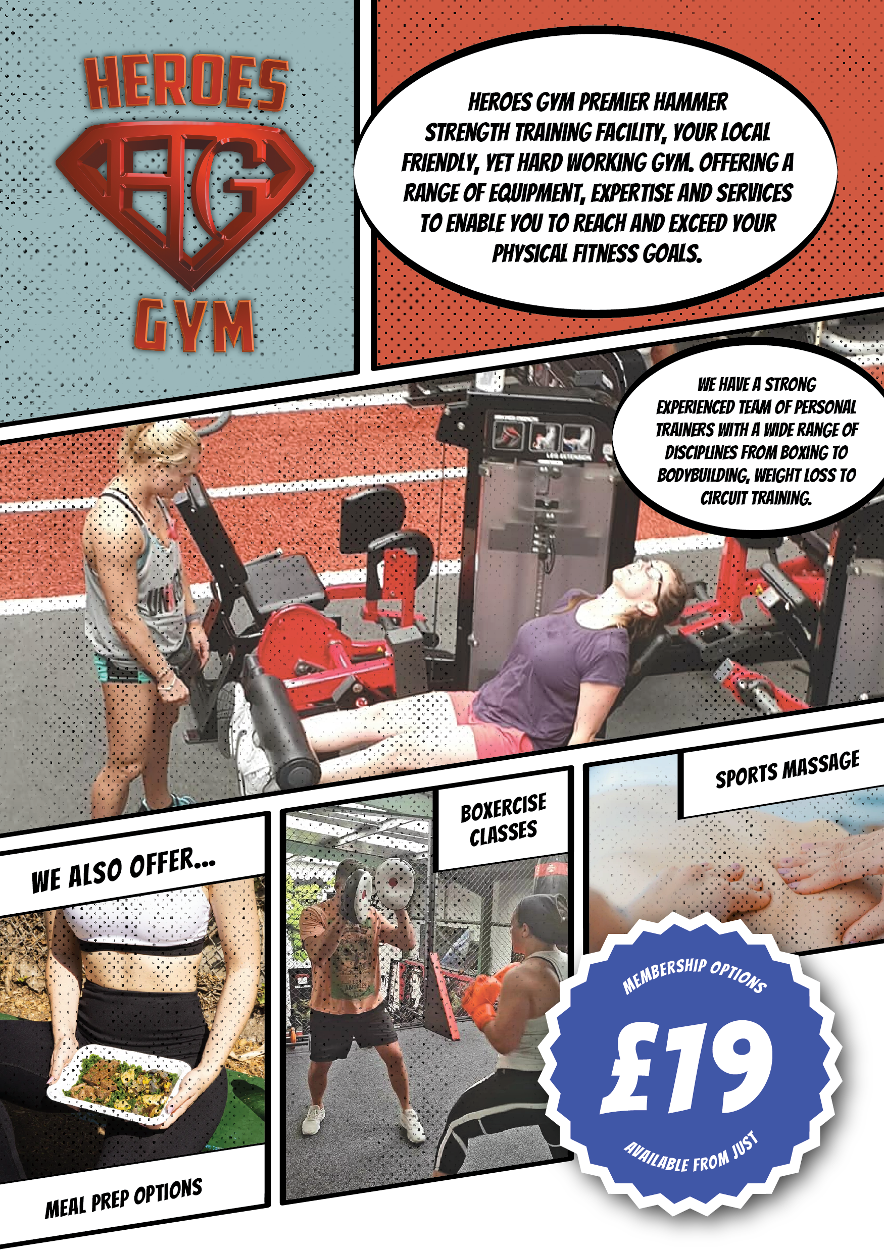
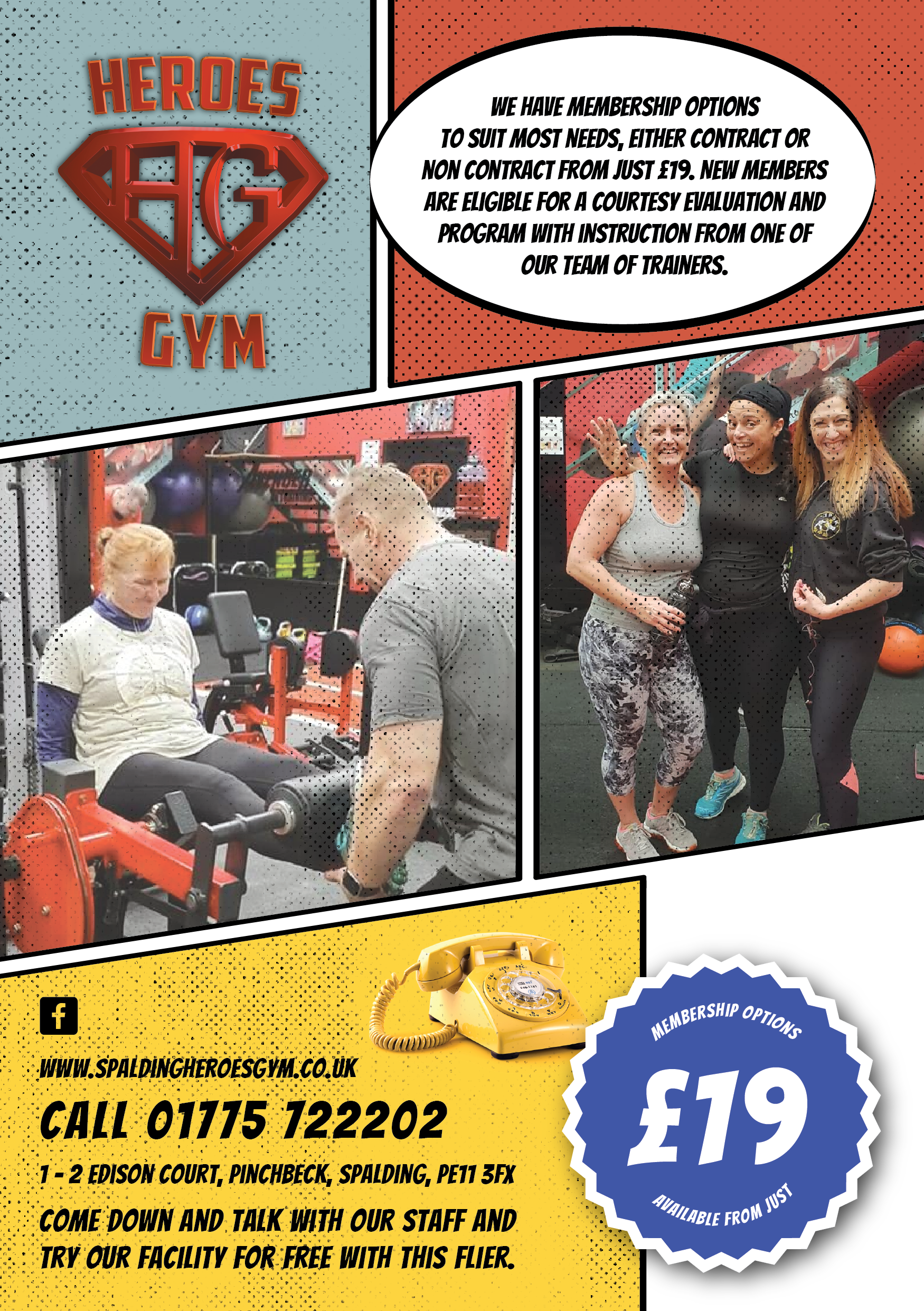
Working with such a wide span of clients often doesn't allow me to get too familiar with any particular brand, but Heroes Gym are such frequent fliers that not only am I very familiar with their brand, but they tend to leave their briefs wide open and trust that I'll design them something that exceeds their expectations. I was thrilled when they contacted us to design some promotional print material (an A5 flyer to be exact) to be distributed in a local newspaper.
Pow! Paneled design
After being provided with some copy and photos for the leaflets, I wanted to create a vintage comic book look to buy in to the gym's obvious theme. This provided an engaging and colourful canvas on which to place the content. Some well-placed pointillist/halftone textures and colour correction would also disguise the low resolution of some of the photos provided.
After one or to tweaks - which have to be expected when clients tell you to go forth and design in such a free-range way - the leaflets were good to go!

