Designing for PR and social media purposes are my absolute favourite graphic design projects as not only can you throw your most trendy and contemporary designs out there, but you get to figure out really quickly if your designs are a hit or a miss so you can fix them or perfect them for next time. I joined BM at a super exciting time, mid rebrand in fact, which meant I had loads of opportunity to shake up templates and really set the trend for us moving forward
Influencer boxes
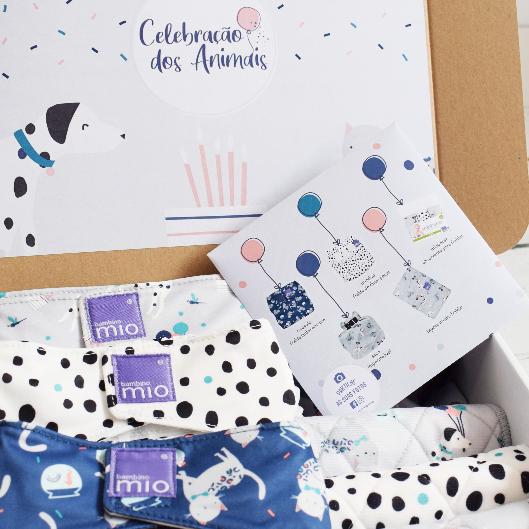
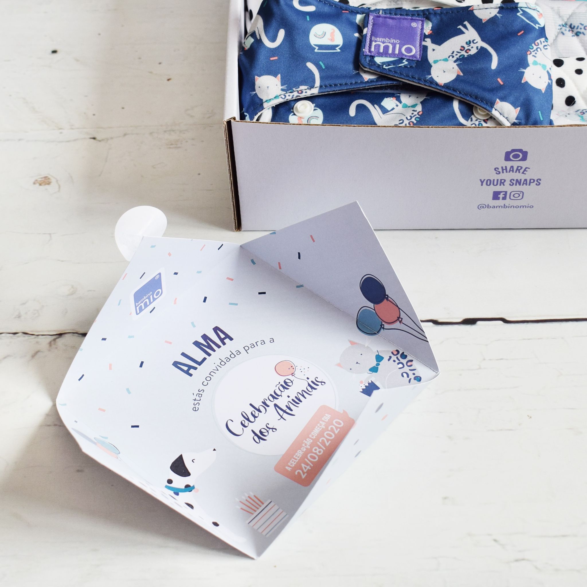
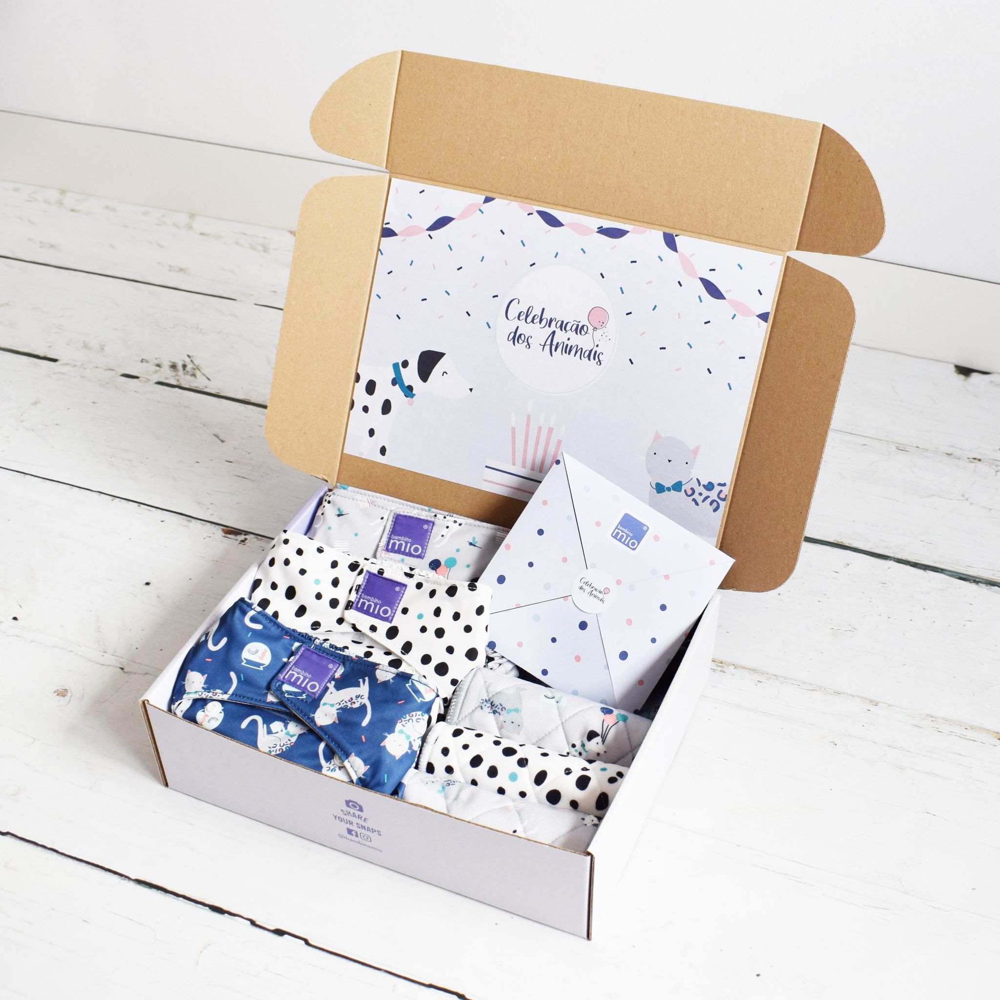
influencer boxes are some of the most creative and openly briefed assets we have to deal with, so as a team we have a love/hate relationship with them. They boil down to a box of sample baby products for influencers to use to share and create hype on social media. The only rules are that it has to absolutely scream the product range in the look, feel and characters featured and whatever you create has to get approved by the powers that be.
Coming from a web background into an environmentally conscious and therefore paperless company, I don't have as much print experience as I'd like to have, but this was a super cute opportunity for me to have a play around with it.
In case you don't read Portugese, this box contains a personalised invitation for baby Alma to gather up all her furry friends and join the pet party. I did put together designs for DIY Party hats and masks and even a board game which would have been crazy fun. But in order to really push that eco messaging, we decided to hold back on any additional assets and go for the more simple and sweet approach to this small product launch campaign.
Get Growing!
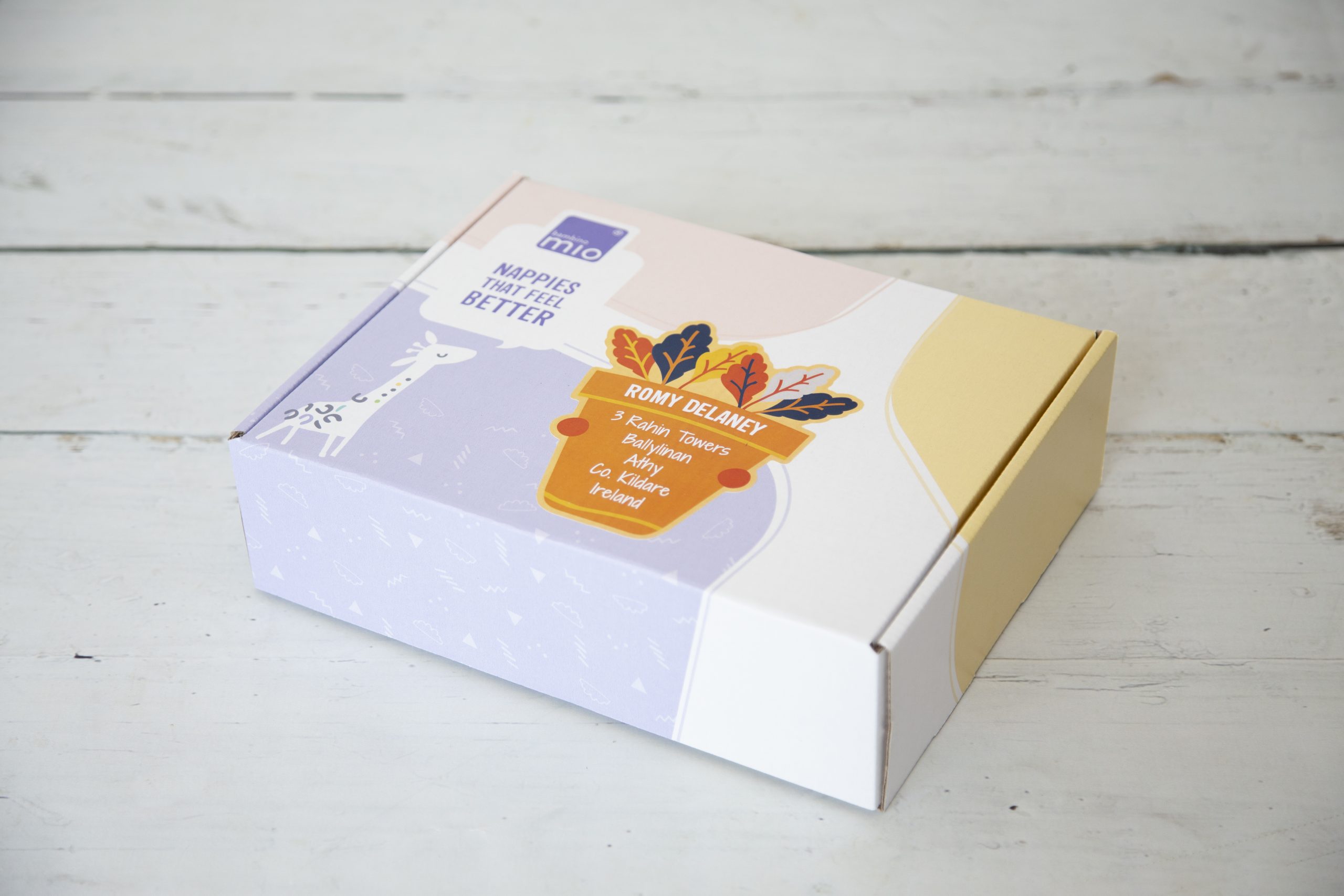
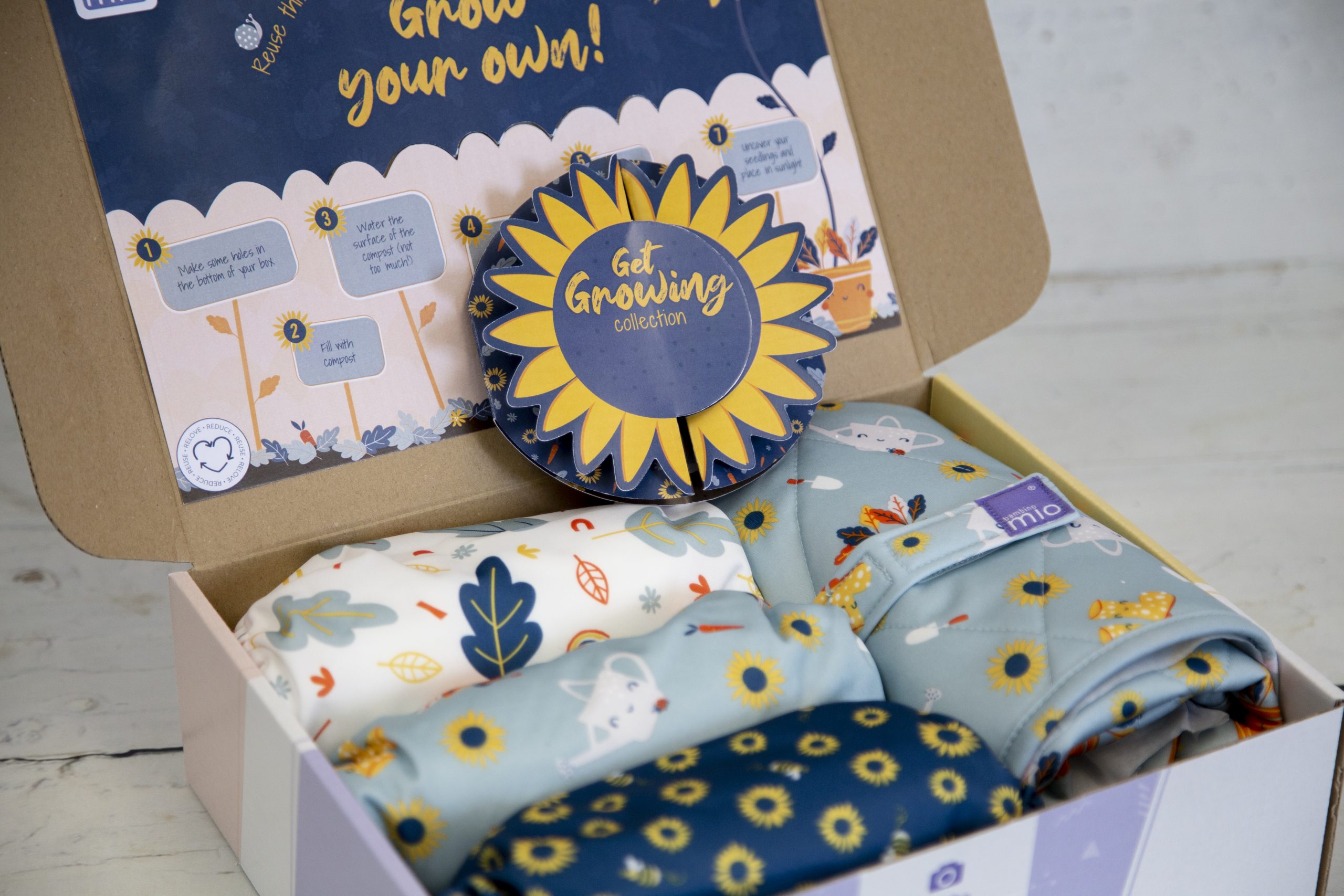
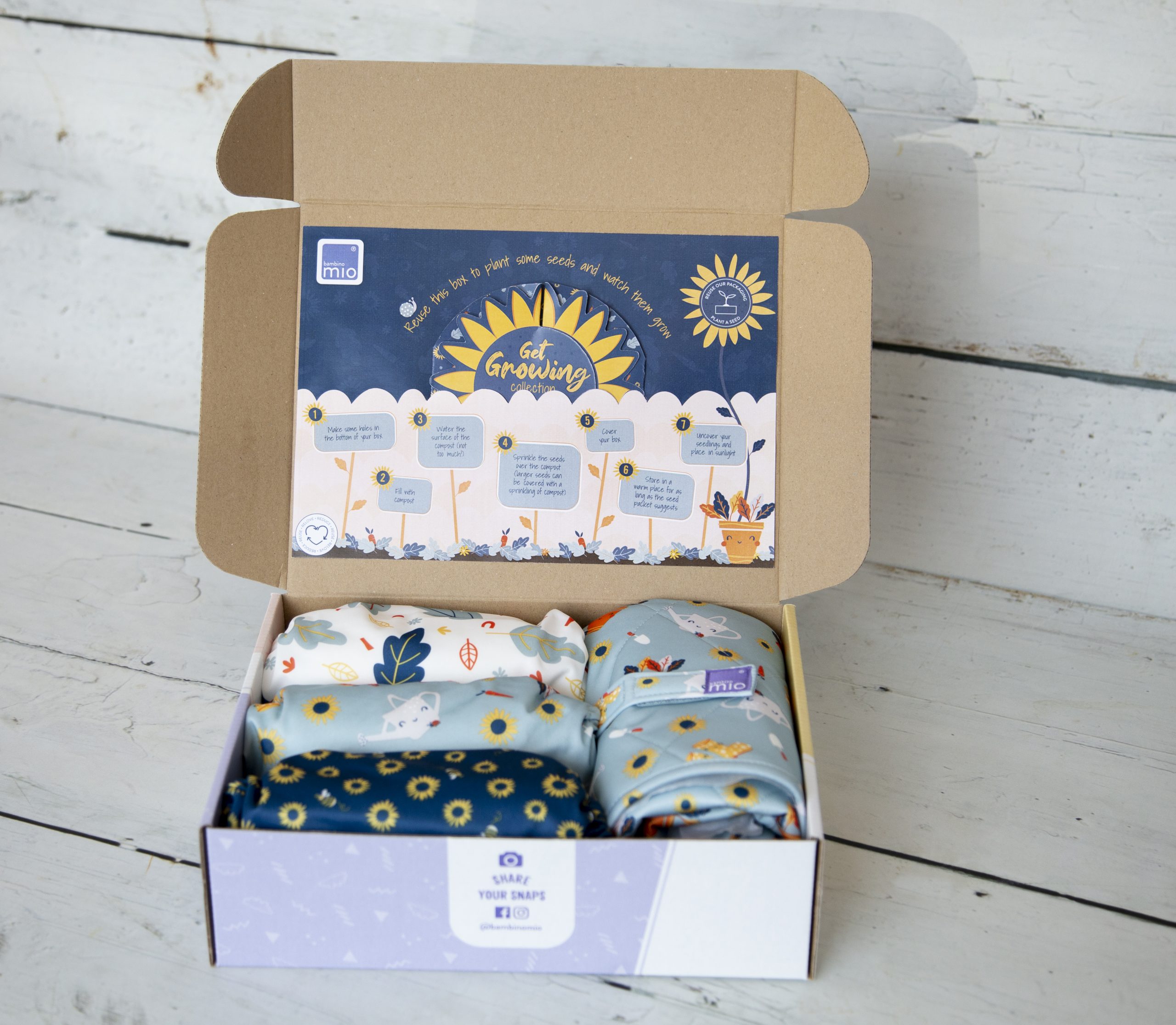
Toward the end of my role at Bambino Mio I took on an exciting influencer box project in which i got to work with one of my colleagues Emma to construct a really cool box.
She worked on the collection card & sticker, while I worked on the inside box sticker and worked on the concept and the mechanics of getting the pieces to slot together. Although there were a few hiccups on the big day, those being the breaking down of out cutting machine, so having to cut complex pieces out by hand - the result was really cool!
PR looksheets
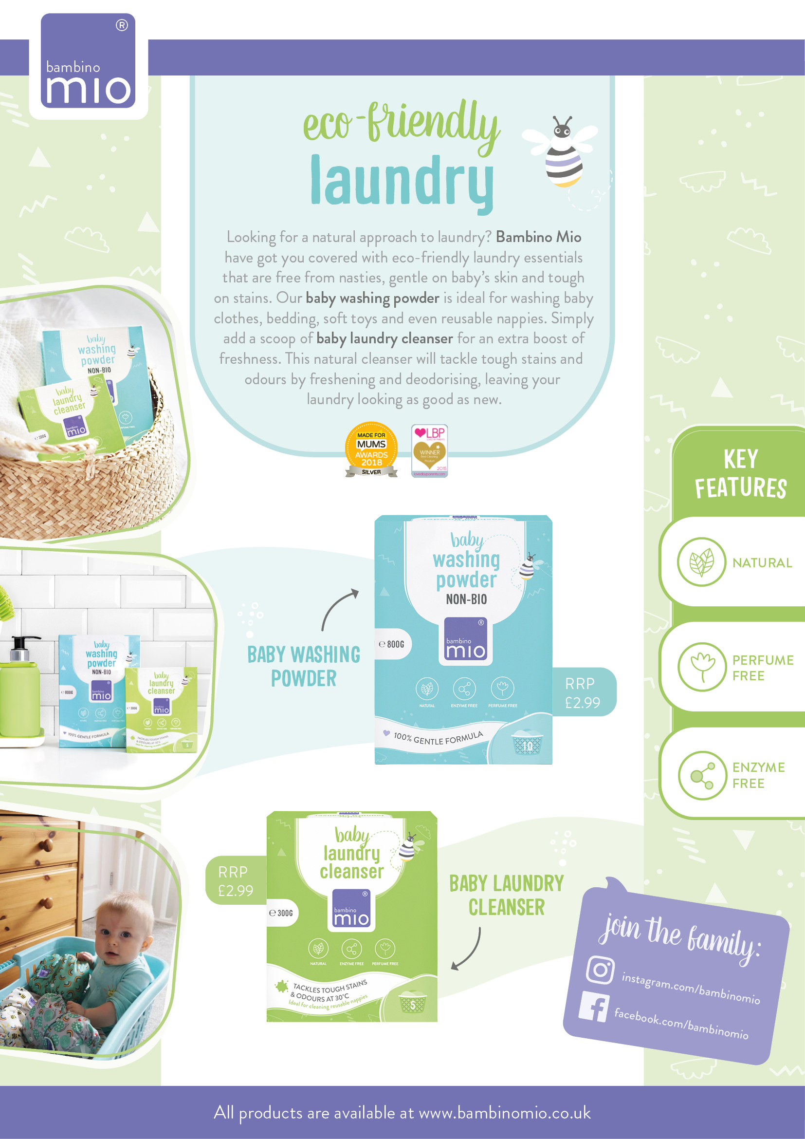
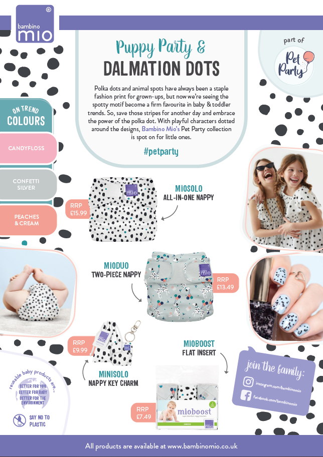
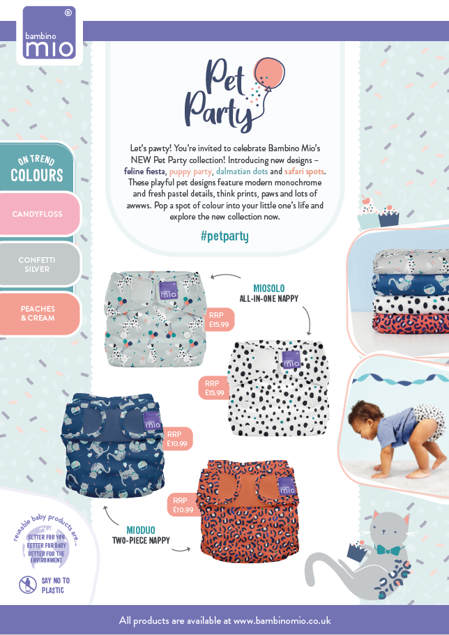
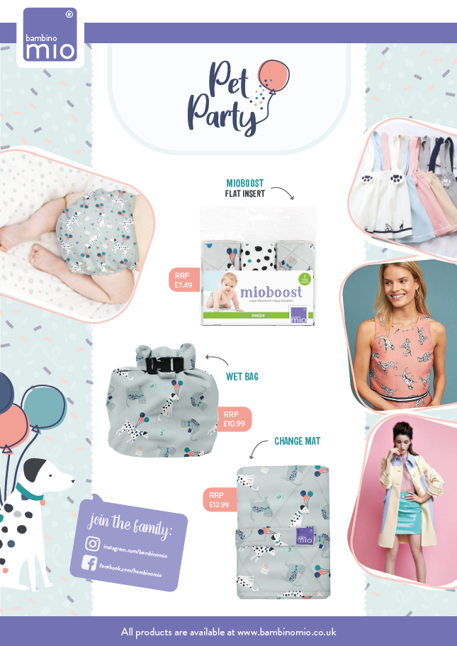
my favourite excuse to hop on pinterest during work time! Our old PR looksheets were ok, but compared to our branding, they were a bit pointy, a bit busy and I felt like they weren't laid out as seamlessly as they could be. Creating a looksheet in the old style and then overhauling the template with a fresh eye was one of my first tasks at BM.
the old
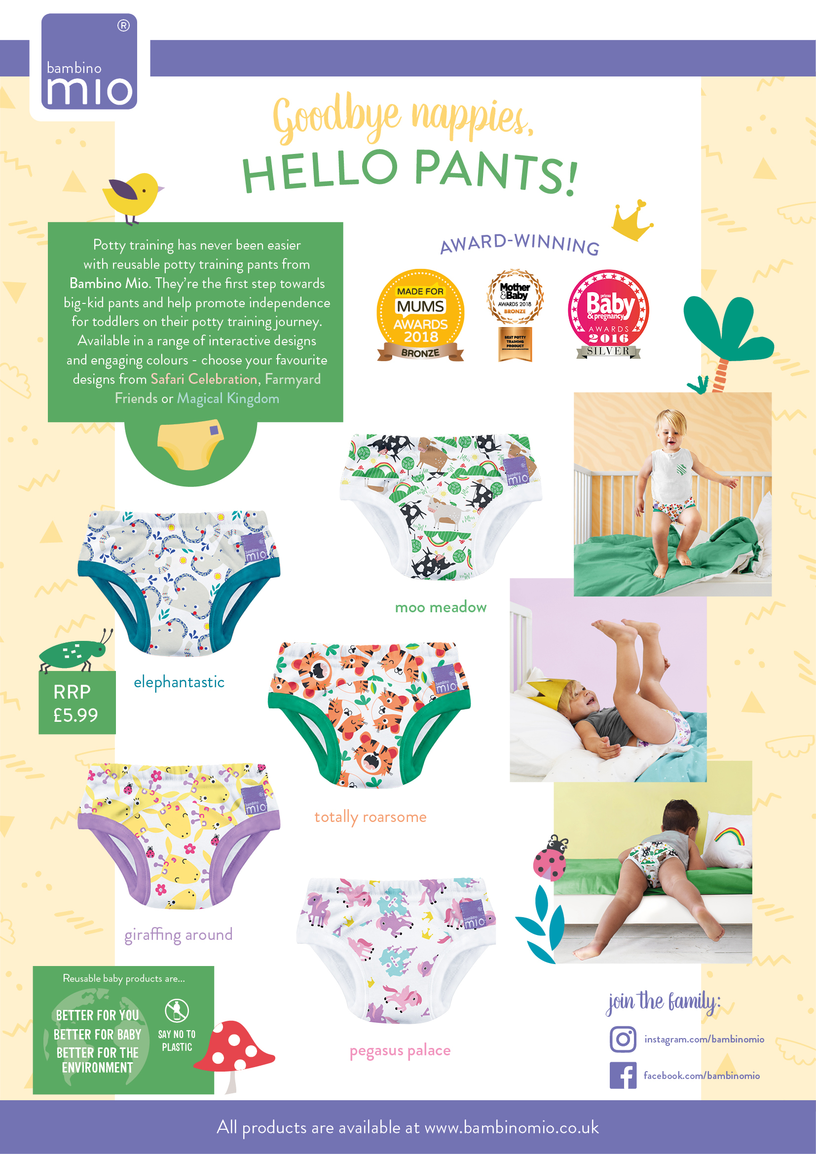
vs the new
I'm part of an inhouse graphic design team at Bambino Mio and I have taken care to include assets I worked on exclusively, I spearheaded, or assets I worked heavily on.
All assets featured here are the property of Bambino Mio

