That's a live, playable mini game you've got there. Pick a tool and see if you can make your garden grow!
As a designer, I'm always looking to push the boundaries of what I can create, so when the term 'gamification' gets thrown around it sends my mind reeling with ideas, and as someone who used to be a little obsessed with Miniclip and Eyezmaze games, I very quickly figured out what I would do if this gamification idea was left up to me. So I got to work and designed & built this very basic mini game as a proof of concept that we could produce a very simple, very playable game that could not only provide our customers the opportunity to knock a few pounds off of their spend, but give them an experience they'd want to revisit and share with others. And it only took me the best part of a day to take from concept, to what you see here.
concepting and building
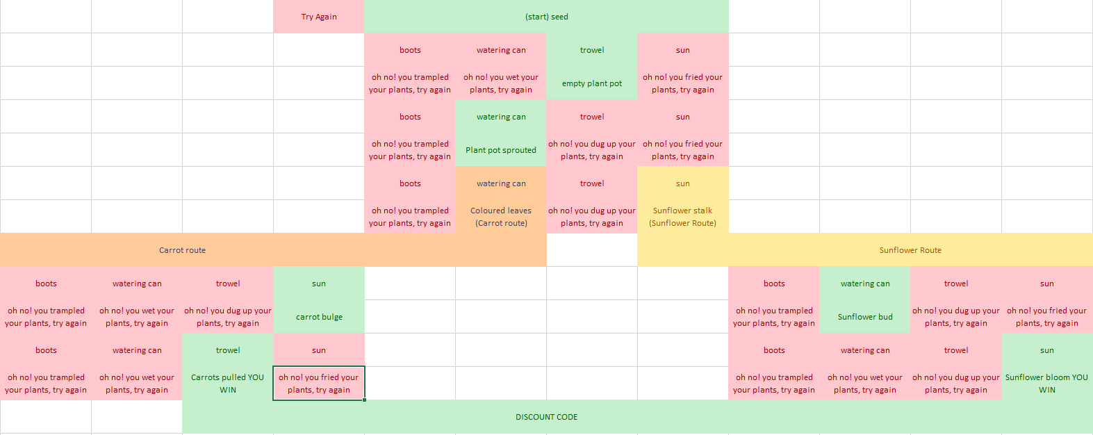
Lockdown was a strange time and I think we all went a little round the bend, so when I had a few hours spare I worked up the artwork you can see used in this game and a map of how this game would work (spoilers for if you'd like to figure out how to grow some plants).

This is a very simple button clicking game built as a multi page ad in Google Web Designer. The different tools act as buttons (events) that click through to a certain page. Each row of 4 represents the tools on a page, those marked in green on the map take you to the next page on the way to winning, while the red squares all link to a page which says to start again (FYI I built one of each losing page and linked to it with a button, I didn't create a duplicate each time like this map suggests, that would be madness). The yellow and orange squares are winning tools, but they show where the game diverges, allowing you two different outcomes for a more exciting and playable user experience.
As this is just a proof of concept, it's pretty basic right now, but the intention would be to animate the transitions between pages and use hoverovers etc., but for now this asset does the job and has lead the way for us to create some exciting new kinds of assets that we didn't have a solid understanding of until now.
Update: Practical application & business use
So my game concept may have been a little bit too much of a tangent for practical use on the site (although I totally think it could have worked for rolling out a promo code. Oh well.) we did end up using this methodology to create what would have been an image of a great big sprawling flow chart, which would have been really inelegant and behind the times to a live quiz that our customers can use to determine which product best suits their needs.
I'm part of an inhouse graphic design team at Bambino Mio and I have taken care to include assets I worked on exclusively, I spearheaded, or assets I worked heavily on.
All assets featured here are the property of Bambino Mio

